- 翰林提供学术活动、国际课程、科研项目一站式留学背景提升服务!
- 400 888 0080
IB DP Maths: AA HL复习笔记4.1.6 Univariate Data
Univariate data is data that is in one variable.
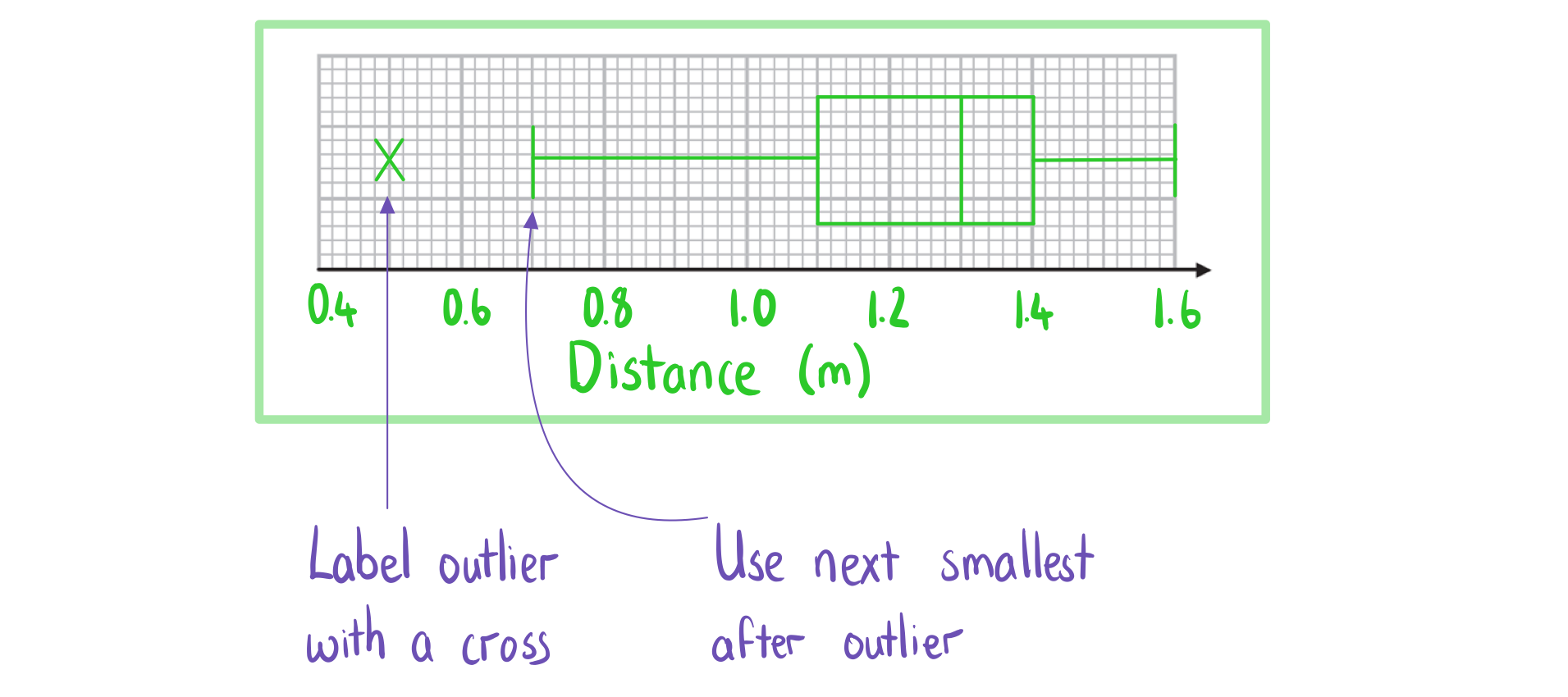
Box Plots
What is a box plot (box and whisker diagram)?
- A box plot is a graph that clearly shows key statistics from a data set
- It shows the median, quartiles, minimum and maximum values and outliers
- It does not show any other individual data items
- The middle 50% of the data will be represented by the box section of the graph and the lower and upper 25% of the data will be represented by each of the whiskers
- Any outliers are represented with a cross on the outside of the whiskers
- If there is an outlier then the whisker will end at the value before the outlier
- Only one axis is used when graphing a box plot
- It is still important to make sure the axis has a clear, even scale and is labelled with units
What are box plots useful for?
- Box plots can clearly show the shape of the distribution
- If a box plot is symmetrical about the median then the data could be normally distributed
- Box plots are often used for comparing two sets of data
- Two box plots will be drawn next to each other using the same axis
- They are useful for comparing data because it is easy to see the main shape of the distribution of the data from a box plot
- You can easily compare the medians and interquartile ranges
Exam Tip
- In an exam you can use your GDC to draw a box plot if you have the raw data
- You calculator's box plot can also include outliers so this is a good way to check
Worked Example

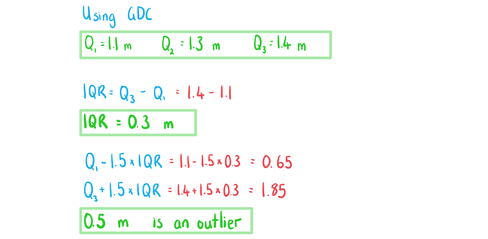
b) Draw a box plot for the data.
Cumulative Frequency Graphs
What is cumulative frequency?
- The cumulative frequency of x is the running total of the frequencies for the values that are less than or equal to x
- For grouped data you use the upper boundary of a class interval to find the cumulative frequency of that class
What is a cumulative frequency graph?
- A cumulative frequency graph is used with data that has been organised into a grouped frequency table
- Some coordinates are plotted
- The x-coordinates are the upper boundaries of the class intervals
- The y-coordinates are the cumulative frequencies of that class interval
- The coordinates are then joined together by hand using a smooth increasing curve
What are cumulative frequency graphs useful for?
- They can be used to estimate statistical measures
- Draw a horizontal line from the y-axis to the curve
- For the median: draw the line at 50% of the total frequency
- For the lower quartile: draw the line at 25% of the total frequency
- For the upper quartile: draw the line at 75% of the total frequency
- For the pth percentile: draw the line at p% of the total frequency
- Draw a vertical line down from the curve to the x-axis
- This x-value is the relevant statistical measure
- Draw a horizontal line from the y-axis to the curve
- They can used to estimate the number of values that are bigger/small than a given value
- Draw a vertical line from the given value on the x-axis to the curve
- Draw a horizontal line from the curve to the y-axis
- This value is an estimate for how many values are less than or equal to the given value
- To estimate the number that is greater than the value subtract this number from the total frequency

-
- They can be used to construct a box plot for grouped data
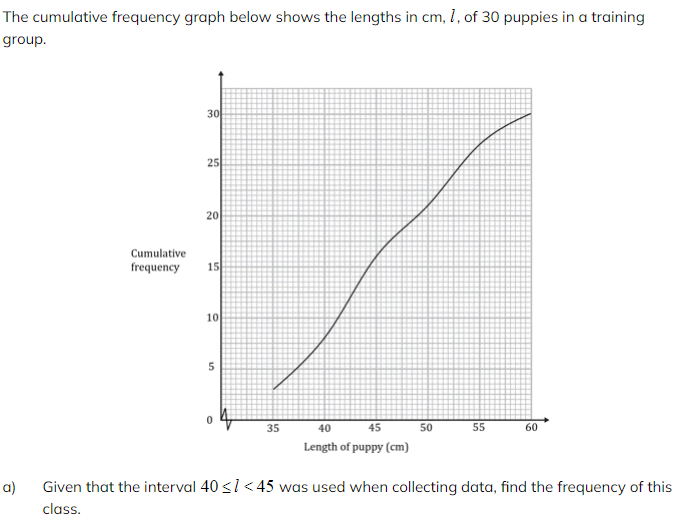
 b) Use the graph to find an estimate for the interquartile range of the lengths.
 c) Estimate the percentage of puppies with length more than 51 cm.
Histograms
What is a (frequency) histogram?
- A frequency histogram clearly shows the frequency of class intervals
- The classes will have equal class intervals
- The frequency will be on the y-axis
- The bar for a class interval will begin at the lower boundary and end at the upper boundary
- A frequency histogram is similar to a bar chart
- A bar chart is used for qualitative or discrete data and has gaps between the bars
- A frequency histogram is used for continuous data and has no gaps between bars
What are (frequency) histograms useful for?
- They show the modal class clearly
- They show the shape of the distribution
- It is important the class intervals are of equal width
- They can show whether the variable can be modelled by a normal distribution
- If the shape is symmetrical and bell-shaped
Worked Example
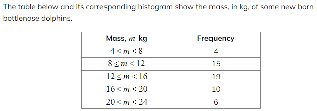 a) Draw a frequency histogram to represent the data.
 b) Write down the modal class.
-
转载自savemyexams

在线登记
最新发布
翰林课程体验,退费流程快速投诉邮箱: yuxi@linstitute.net 沪ICP备2023009024号-1

